-
Loading preview, please wait...
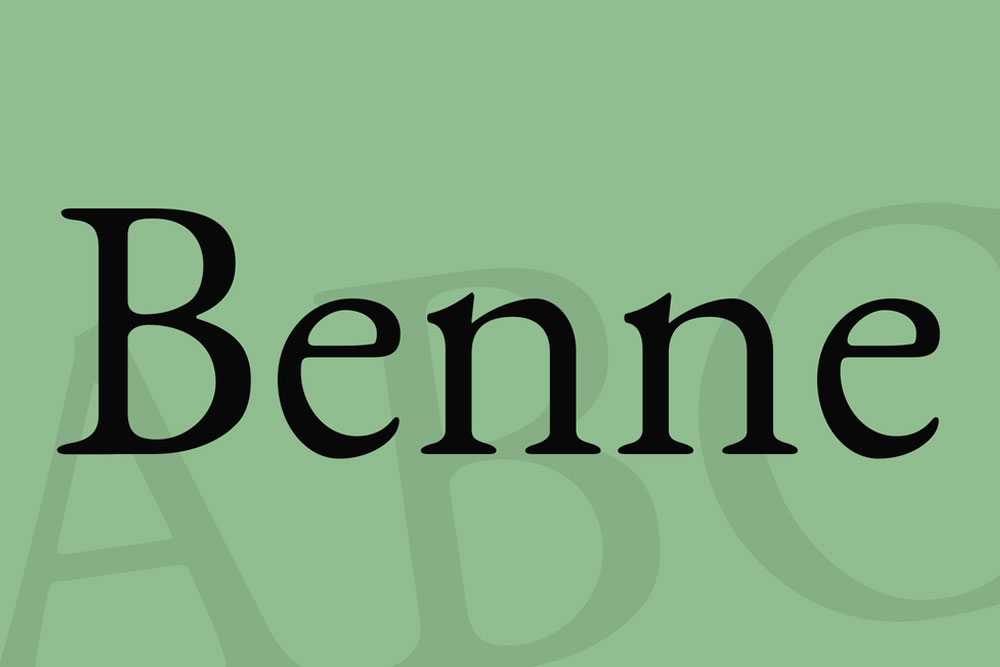
Benne Regular Serif Font
Benne Regular Serif Font is a sleek design that combines graceful movement with an elegant typeface, this family of styles offers new versatility. It Comes with regular and italic fonts and contains a complete full set of glyphs, including extended language support.
It works well on logos, packaging, restaurant graphics, or any display use, as well as in headlines or shorter texts.
Include Files
- OTF
License: For Personal Use.
Font Type: Free
This font is free for PERSONAL USE.
Find the source here – Click Here
Benne Regular Serif Font: A Timeless Typeface for Contemporary Design
Typography plays a vital role in shaping the visual identity of any design project, from printed materials to digital interfaces. The choice of a font can convey a multitude of messages and emotions, and one typeface that has consistently captured the essence of classic sophistication is the Benne Regular Serif Font. In this detailed exploration, we delve into the world of Benne Regular, examining its origins, characteristics, and its enduring appeal in contemporary design.
The History of Benne Regular Serif Font
Benne Regular Serif Font belongs to the venerable genre of serif typefaces, which can trace their origins back to the early days of typography in the 15th century. Serifs are the small decorative strokes that extend from the edges of the main strokes of a letter, and they serve to improve readability and lend a sense of tradition and elegance to the type.
The design of Benne Regular Serif Font draws inspiration from some of the most iconic serif typefaces in history, particularly those created during the Renaissance period when typography was undergoing a renaissance of its own. The graceful curves, well-balanced proportions, and subtle serifs of Benne Regular Serif Font pay homage to these timeless classics while infusing a contemporary twist.
Characteristics of Benne Regular Serif Font
- Elegance and Versatility: Benne Regular Serif Font is known for its timeless elegance. Its letters exude a sense of sophistication and refinement, making it a versatile choice for a wide range of design applications. Whether it’s used in a formal invitation, a corporate logo, or a book cover, Benne Regular Serif Font adds a touch of class.
- Readability: Serif fonts are renowned for their readability, and Benne Regular is no exception. Its carefully crafted letterforms ensure that text remains legible, even at smaller font sizes, making it an excellent choice for body text in books, magazines, and websites.
- Aesthetic Balance: The font’s balanced proportions and letter spacing contribute to a harmonious overall appearance. Its characters flow seamlessly from one to the next, creating a visually pleasing reading experience.
- Variety of Weights: Benne Regular Serif Font is often available in various weights, including light, regular, bold, and italic variants. This versatility allows designers to play with different styles within the same typeface, adding depth and character to their projects.
- OpenType Features: Many versions of Benne Regular Serif Font come equipped with OpenType features, enabling designers to access alternate characters, ligatures, and other typographic enhancements. These features provide additional creative possibilities and customization options.
Contemporary Applications of Benne Regular Serif Font
While Benne Regular Serif Font carries a rich historical legacy, it is far from being relegated to the past. In fact, it continues to find relevance in contemporary design projects across various industries. Here are some notable applications:
- Branding: Companies seeking to convey a sense of heritage, reliability, and sophistication often turn to Benne Regular Serif Font for their logos and brand identities. Its classic yet modern look can help establish a strong brand image.
- Editorial Design: Benne Regular is a favorite among editorial designers for its readability and elegance. It is commonly used in magazines, newspapers, and books to create an engaging reading experience.
- Web Design: In the digital age, typography plays a crucial role in web design. Benne Regular Serif Font’s legibility and classic appeal make it an excellent choice for websites, especially for long-form content and headings.
- Invitations and Stationery: Whether for weddings, formal events, or personal stationery, Benne Regular Serif Font adds a touch of sophistication to printed materials. Its versatility allows for a range of creative design options.
- Packaging Design: Premium products often rely on Benne Regular Serif Font to convey a sense of quality and exclusivity through packaging design. Its timeless aesthetic can enhance the perceived value of a product.
Conclusion
In a world of ever-evolving design trends, the enduring charm of Benne Regular Serif Font stands as a testament to the timeless appeal of classic typography. With its elegance, readability, and versatility, it continues to find its place in the contemporary design landscape. Whether in print or digital media, Benne Regular Serif Font embodies the perfect balance between tradition and modernity, making it a go-to choice for designers seeking to convey sophistication and style in their projects. So, next time you embark on a design journey, consider letting Benne Regular Serif Font lend its classic touch to your creation, adding a touch of timeless beauty to your message.
Share Now!
Related Products


Related Products

Same Contributor

Featured Products