-
Loading preview, please wait...
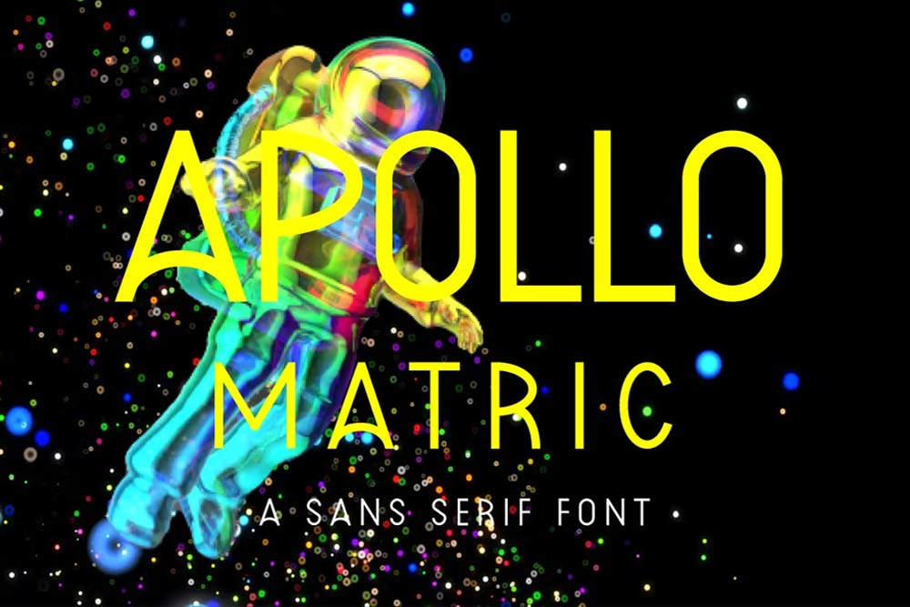
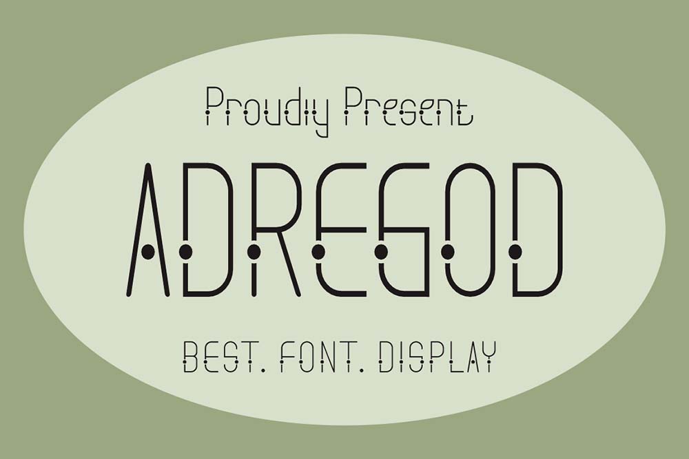
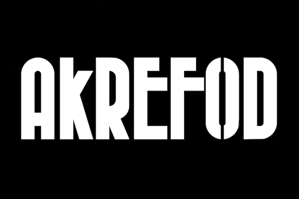
Apollo Matric Sans Serif
Proudly present a new product Apollo Matric Sans Serif.
Apollo Matric Sans Serif: A Masterpiece of Modern Typography. Perfect for both the professional and branding needs of a product.
The main purpose that most people out there like this font is its uniqueness and creativity. Designers would just love to use its creative design in their projects and make them more professional and user-friendly.
Include Files
- TTF, OTF
License: For Personal Use.
Font Type: Free
This font is free for PERSONAL USE.
Link to purchase the full version and commercial use: Click Here
Apollo Matric Sans Serif: Where Form Meets Function
In the world of typography, the Apollo Matric Sans Serif font family stands as a testament to the art of combining form and function. In this detailed exploration, we will delve into the nuances of this font and uncover how it strikes a harmonious balance between aesthetic appeal and practical utility.
The Aesthetics of Simplicity
Apollo Matric Sans Serif embraces the beauty of simplicity in its design. Its clean lines, uniform stroke widths, and absence of decorative embellishments make it a prime example of minimalist typography. This simplicity lends itself to a wide range of applications where clarity and readability are paramount.
Versatility in Design
One of the defining characteristics of Apollo Matric Sans Serif is its versatility. This font family offers a variety of weights and styles, from thin and elegant to bold and assertive. Such diversity provides designers with a comprehensive toolkit to convey their messages effectively, making it suitable for a broad spectrum of design projects.
Functional Legibility
Beyond its aesthetic appeal, Apollo Matric Sans Serif places a strong emphasis on legibility. The uniformity of its letterforms and the absence of serifs contribute to its high level of readability, even in challenging environments such as small text sizes or low-resolution screens. This focus on functional legibility makes it an excellent choice for both print and digital applications.
Multilingual Support
In our globalized world, multilingual support is essential. Apollo Matric Sans Serif rises to the occasion by accommodating a wide range of scripts and languages. This extensive support ensures effective communication with diverse audiences around the world, making it a practical choice for international projects.
Adaptability Across Mediums
A font’s true value lies in its adaptability across various media and platforms. Apollo Matric Sans Serif excels in this aspect, maintaining its visual integrity and legibility regardless of whether it is displayed on screens of different sizes and resolutions or used in traditional print media. Its adaptability makes it a versatile choice for a wide array of design projects.
Attention to Detail
What sets Apollo Matric Sans Serif apart is its meticulous attention to detail. While it embraces simplicity, it does so with precision. Every character is carefully crafted to maintain balance and harmony within the font family. This meticulous approach contributes to the font’s overall visual cohesiveness.
Conclusion: Apollo Matric Sans Serif – The Power of Simplicity
In conclusion, the Apollo Matric Sans Serif font family exemplifies the power of simplicity in typography. Its clean, minimalist design, combined with a focus on functional legibility, makes it a valuable asset for designers seeking to convey their messages with clarity and precision. Whether your design calls for a refined elegance or a bold statement, Apollo Matric Sans Serif provides the creative tools to achieve your vision. It’s not just a font; it’s a testament to the enduring appeal of simplicity in design, eagerly awaiting the opportunity to enhance your next project with its versatile and functional beauty.
Share Now!
Related Products


Related Products
Same Contributor
Featured Products