-
Loading preview, please wait...
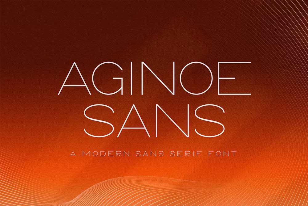
Aginoe Sans pro font
Proudly present a new product Aginoe Sans pro font.
Aginoe Sans pro font: A Masterpiece of Modern Typography. Perfect for both the professional and branding needs of a product.
The main purpose that most people out there like this font is its uniqueness and creativity. Designers would just love to use its creative design in their projects and make them more professional and user-friendly.
Include Files
- TTF, OTF
License: For Personal Use.
Font Type: Free
Aginoe Sans Pro Font: A Seamless Blend of Elegance and Functionality
In the ever-evolving landscape of design and typography, selecting the right font is akin to choosing the perfect brush for a masterpiece. Among the plethora of options available, Aginoe Sans Pro Font emerges as a versatile and elegant choice, seamlessly blending aesthetic appeal with functional efficiency. This overview delves into the nuances of Aginoe Sans Pro, exploring its origins, design elements, applications, and the reasons behind its growing popularity.
Origins and Development:
Aginoe Sans Pro Font is the brainchild of talented type designer Jérémie Hornus. Born out of the renowned Black Foundry, a type design studio known for its commitment to quality and innovation, this font reflects Hornus’s dedication to crafting visually striking and highly functional typefaces.
The development of Aginoe Sans Pro was rooted in a desire to create a modern sans-serif typeface that could cater to a diverse range of design needs. Hornus envisioned a font that seamlessly merged readability with a distinctive personality, making it suitable for a wide array of applications, from print to digital media.
Design Elements:
1. Elegance and Simplicity:
Aginoe Sans Pro strikes a delicate balance between elegance and simplicity. The clean, sans-serif lines exude a modern aesthetic, making it a timeless choice for contemporary design projects. The simplicity of the letterforms enhances readability, ensuring that the message is communicated with clarity and precision.
2. Versatility:
One of the standout features of Aginoe Sans Pro is its versatility. The font is available in a variety of weights and styles, ranging from light to bold, regular to italic. This extensive range empowers designers with the flexibility to use Aginoe Sans Pro across a spectrum of design projects, from headlines and body text to logos and branding materials.
3. Open Apertures:
Aginoe Sans Pro incorporates open apertures in its letterforms, contributing to improved legibility. This design choice enhances the overall readability of the text, making it suitable for a diverse range of applications, including long-form content and small-sized text in print or on screens.
4. Harmonious Proportions:
The proportions of Aginoe Sans Pro are meticulously crafted to ensure a harmonious and balanced appearance. The spacing between letters and the overall rhythm of the typeface contribute to a visually pleasing reading experience. This attention to detail sets Aginoe Sans Pro apart as a font that not only looks good but also performs exceptionally well in various design contexts.
Applications:
1. Editorial Design:
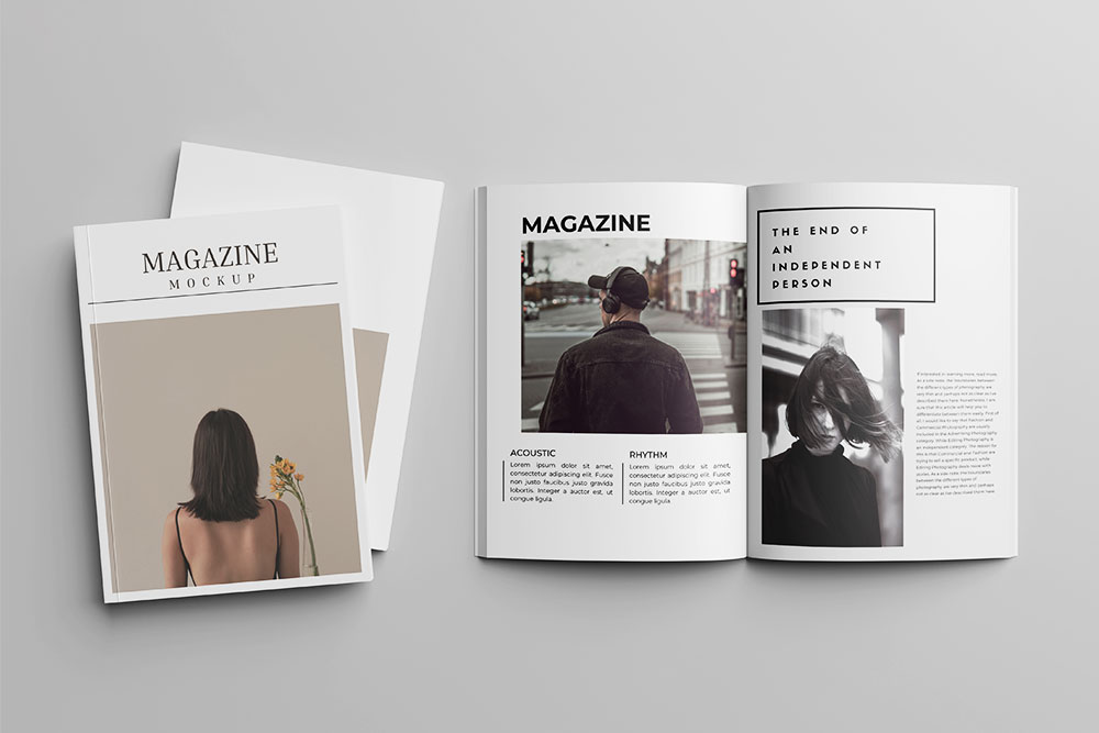
Aginoe Sans Pro finds a natural home in editorial design, where its readability and clean lines make it an ideal choice for body text. Whether it’s a magazine layout, a book, or a newspaper, the font’s versatility allows it to adapt seamlessly to different content and design requirements.
2. Branding and Logos:
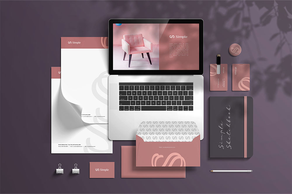
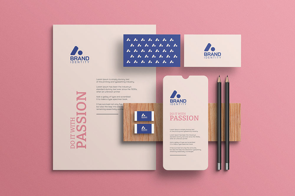
The distinct personality of Aginoe Sans Pro makes it a valuable asset in branding and logo design. The font’s range of weights and styles allows designers to create a cohesive and recognizable brand identity across different touchpoints. From bold headlines to subtle taglines, Aginoe Sans Pro adds a touch of sophistication to brand communication.
3. Digital Interfaces:
In the realm of digital design, Aginoe Sans Pro excels. Its open apertures and clean lines ensure optimal legibility on screens of various sizes. Whether used in website interfaces, mobile apps, or digital presentations, the font adapts effortlessly to the dynamic requirements of the digital landscape.
4. Print Design:
Aginoe Sans Pro’s clarity and elegance make it a standout choice in print design. From brochures and posters to packaging and promotional materials, the font brings a level of sophistication that enhances the overall visual impact of printed content.
5. Multilingual Support:
A notable feature of Aginoe Sans Pro is its extensive language support. The font accommodates a wide range of languages, making it a global choice for designers working on projects with diverse linguistic requirements.
SEO-Friendly and Readability:
The SEO landscape has evolved beyond keywords and backlinks; user experience, including readability, is now a crucial factor. Aginoe Sans Pro, with its open apertures, harmonious proportions, and clean design, contributes to an enhanced reading experience.
1. Readability:
The primary goal of any font is to facilitate easy reading, and Aginoe Sans Pro excels in this regard. The well-balanced letterforms and thoughtful spacing contribute to text that is not only aesthetically pleasing but also easy on the eyes. This readability factor is essential for keeping visitors engaged on websites and ensuring that the content is consumed and understood.
2. Responsive Design:
In the era of responsive design, where websites need to adapt seamlessly to various devices and screen sizes, Aginoe Sans Pro shines. Its legibility on both small and large screens makes it a practical choice for designers aiming to deliver a consistent and enjoyable user experience across devices.
3. Loading Speed:
The efficiency of a font can impact website loading speed. Aginoe Sans Pro, with its well-optimized design, ensures that the text renders smoothly and quickly. This is a crucial aspect of SEO, as faster-loading websites are favored by search engines and provide a better user experience.
4. Mobile-Friendly:
Given the increasing prevalence of mobile browsing, having a font that is mobile-friendly is essential. Aginoe Sans Pro’s clean and open design makes it highly suitable for mobile interfaces, contributing to a positive user experience on smartphones and tablets.
Popularity and Community Adoption:
Aginoe Sans Pro has garnered a rapidly growing community of designers and typographers who appreciate its aesthetic appeal and functionality. The font’s popularity can be attributed to several factors:
1. Quality Craftsmanship:
The font’s origin from the Black Foundry, known for its commitment to quality type design, is a testament to the craftsmanship behind Aginoe Sans Pro. Designers value fonts that are well-crafted, and Aginoe Sans Pro has earned a reputation for excellence in design.
2. Versatility:
The versatility of Aginoe Sans Pro, with its range of weights and styles, makes it a go-to choice for a diverse range of design projects. This adaptability is a key factor in its widespread adoption across different industries and design contexts.
3. Global Appeal:
The font’s multilingual support adds to its global appeal. In an interconnected world, where design projects often cater to diverse audiences, the ability to seamlessly integrate different languages is a valuable asset.
4. Positive User Experiences:
Designers and developers who have incorporated Aginoe Sans Pro into their projects often report positive user experiences. Whether in terms of increased engagement on websites or positive feedback on printed materials, the font has proven its effectiveness in real-world applications.
Conclusion:
Aginoe Sans Pro Font stands as a testament to the intersection of artistry and functionality in typography. From its elegant design elements to its versatile applications, this font embodies the essence of modern type design. Whether you’re crafting a magazine layout, designing a brand identity, or optimizing a website for SEO, Aginoe Sans Pro offers a harmonious blend of aesthetics and usability.
Share Now!

