-
Loading preview, please wait...
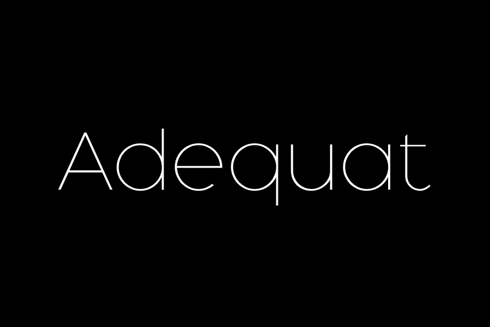
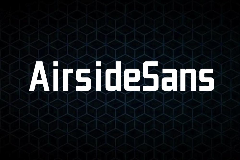
Adequate light pro font
Proudly present a new product Adequate light pro font.
Adequate light pro font: A Masterpiece of Modern Typography. Perfect for both the professional and branding needs of a product.
The main purpose that most people out there like this font is its uniqueness and creativity. Designers would just love to use its creative design in their projects and make them more professional and user-friendly.
Include Files
- TTF, OTF
License: For Personal Use.
Font Type: Free
Link to purchase the full version and commercial use: Click here
Adequate Light Pro Font: Illuminating Design with Clarity and Elegance
In the realm of design and typography, the choice of font plays a pivotal role in conveying a message, capturing attention, and establishing a visual identity. One such font that has been gaining traction for its versatility, clarity, and aesthetic appeal is the Adequate Light Pro Font. In this comprehensive overview, we’ll delve into the characteristics, applications, and benefits of this font, exploring how it has become a staple in the toolkit of designers and creatives.
Unveiling Adequate Light Pro Font
Adequate Light Pro Font is a typeface renowned for its clean lines, balanced proportions, and overall readability. Developed with a keen eye for detail and a commitment to functionality, this font strikes the delicate balance between professionalism and creative expression. Its light weight imbues a sense of elegance and modernity, making it suitable for a myriad of design projects across various industries.
Key Characteristics:
- Clarity and Readability:
- Adequate Light Pro Font is designed with a focus on clarity, ensuring that each character is easily distinguishable. This makes it an ideal choice for projects where readability is paramount, such as websites, presentations, or editorial content.
- Modern Aesthetics:
- The font’s sleek and modern aesthetics contribute to its popularity in contemporary design. Whether used in print or digital media, Adequate Light Pro Font adds a touch of sophistication to any visual composition.
- Versatility:
- Its versatility is a standout feature. From corporate documents to creative projects, this font adapts seamlessly to diverse design contexts, making it a valuable asset for designers working across different industries.
- Accessibility:
- Accessibility is a key consideration in design, and Adequate Light Pro Font addresses this need by offering a visually accessible option. Its clean lines and well-defined characters enhance the reading experience for a wide audience.
Applications Across Industries
The adaptability of Adequate Light Pro Font extends its application to various industries, making it a versatile choice for designers, businesses, and creatives alike.
1. Editorial Design:
- In the realm of editorial design, where the balance between text and visuals is crucial, Adequate Light Pro Font shines. Its legibility ensures that readers can engage with content effortlessly, whether in magazines, newspapers, or digital publications.
2. Web Design:
- Web designers appreciate the clean and modern aesthetic of Adequate Light Pro Font. It enhances the user experience by providing a legible and visually appealing text, contributing to the overall design harmony of websites.
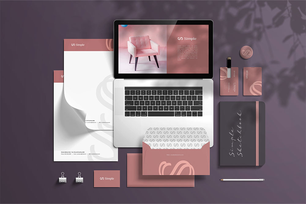
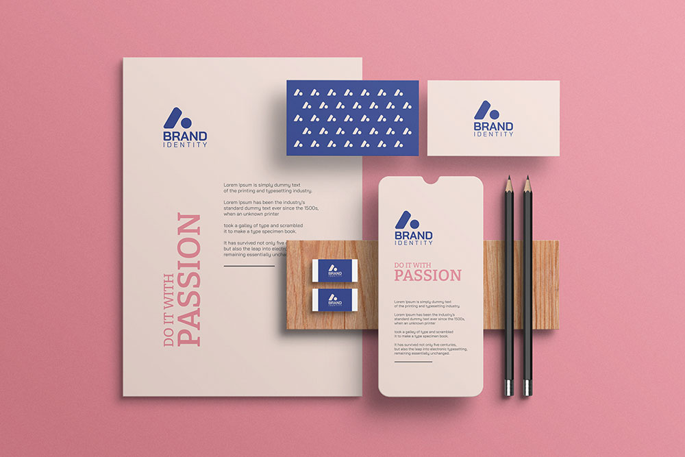
3. Branding and Corporate Identity:
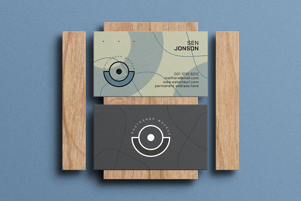
- Establishing a strong brand identity requires a font that reflects the values and personality of a brand. Adequate Light Pro Font, with its contemporary elegance, is an excellent choice for logos, business cards, and other branding materials.
4. Advertising and Marketing Collateral:
- From brochures to posters, the font’s versatility makes it an asset in advertising and marketing materials. Its light weight allows for easy integration into visually engaging layouts without overwhelming the overall design.
5. UI/UX Design:
- User interface and experience designers benefit from the clarity of Adequate Light Pro Font in creating intuitive and user-friendly digital interfaces. The font’s readability enhances the overall usability of applications and websites.
6. Print Design:
- In the realm of print design, where the subtleties of typography can greatly impact the final product, Adequate Light Pro Font excels. Whether used in book layouts, brochures, or packaging, it brings a touch of sophistication to print materials.
SEO-Friendly Readability
In the digital landscape, where search engine optimization (SEO) is a critical consideration, the readability of text plays a significant role in enhancing SEO performance. Adequate Light Pro Font contributes to SEO-friendly design through its:
1. Readability Across Devices:
- With an increasing number of users accessing content on various devices, including smartphones and tablets, the responsive design of Adequate Light Pro Font ensures that text remains readable across different screen sizes.
2. Reduced Bounce Rates:
- Websites and platforms that prioritize readability often experience lower bounce rates. Adequate Light Pro Font’s clarity and legibility contribute to a positive user experience, encouraging visitors to stay and engage with the content.
3. Enhanced User Engagement:
- Content presented in a visually appealing and readable format tends to capture and retain user attention. Adequate Light Pro Font, with its modern and clean design, contributes to enhanced user engagement, a factor that search engines consider in ranking algorithms.
4. Compatibility with SEO Best Practices:
- The font aligns with SEO best practices by providing an accessible and visually pleasing reading experience. As search engines increasingly prioritize user experience, the use of fonts like Adequate Light Pro becomes a strategic design choice.
How to Incorporate Adequate Light Pro Font Into Your Designs
Whether you’re a designer, marketer, or business owner, integrating Adequate Light Pro Font into your designs can be a straightforward process. Consider the following tips:
1. Brand Consistency:
- Maintain consistency across your branding materials by using Adequate Light Pro Font in your logo, business cards, and other brand collateral. Consistency reinforces brand identity and fosters recognition.
2. Complementary Fonts:
- Pair Adequate Light Pro Font with complementary typefaces to create visual interest. Experiment with bold or italic variations to highlight key elements in your designs.
3. Hierarchy and Emphasis:
- Leverage the font’s versatility to establish hierarchy in your designs. Use different weights or sizes to emphasize headers, subheadings, and body text, guiding the viewer’s attention through the content.
4. Responsive Design:
- Ensure that your designs are responsive by testing how Adequate Light Pro Font renders on various devices. This guarantees a consistent and readable experience for users across platforms.
5. Print Material Considerations:
- When using Adequate Light Pro Font in print materials, consider factors such as color contrast, paper quality, and printing techniques to optimize the visual impact of the font in the physical realm.
Share Now!
Related Products

Related Products
Same Contributor
Featured Products