-
Loading preview, please wait...
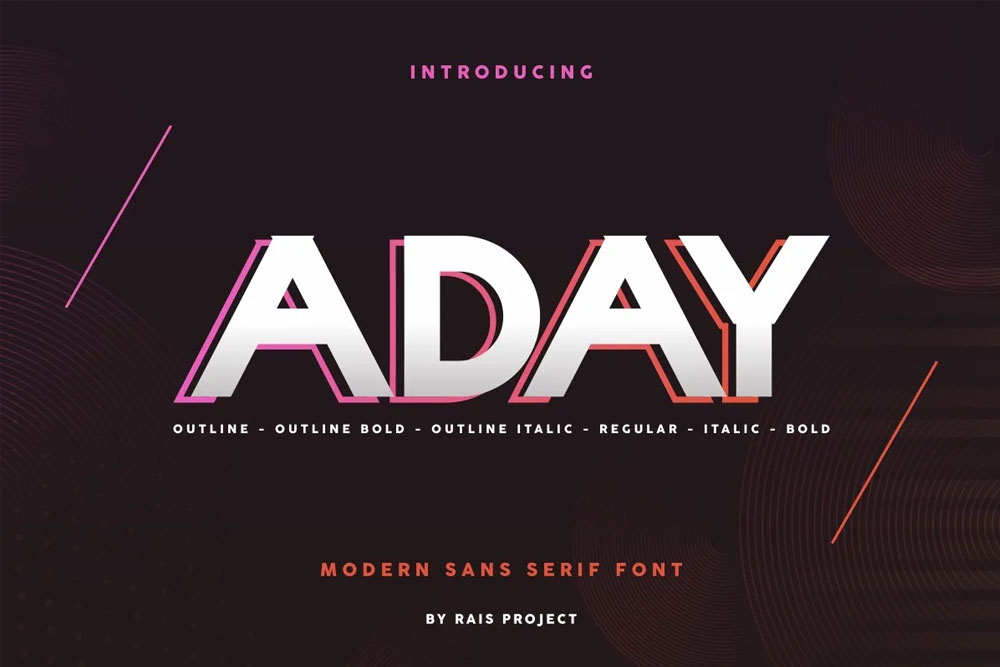
Aday pro font family
Proudly present a new product Aday pro font family.
Aday pro font family: A Masterpiece of Modern Typography. Perfect for both the professional and branding needs of a product.
The main purpose that most people out there like this font is its uniqueness and creativity. Designers would just love to use its creative design in their projects and make them more professional and user-friendly.
Include Files
- TTF, OTF
License: For Personal Use.
Font Type: Free
In the vast landscape of typography, where each font carries its own unique personality, Aday Pro stands out as a versatile and modern font family that caters to a wide range of design needs. From sleek and professional to friendly and approachable, Aday Pro offers a diverse set of styles that make it a go-to choice for designers across various industries.
Introduction to Aday Pro
Aday Pro is a contemporary font family designed with precision and attention to detail. Developed by a team of skilled typographers, it combines functionality with aesthetics, making it suitable for both print and digital applications. The font family includes a variety of weights and styles, providing designers with the flexibility to create visually appealing and readable content.
Key Features
- Multiple Weights and Styles: Aday Pro offers a comprehensive range of weights, from light to bold, allowing designers to create hierarchy and emphasis within their designs. The inclusion of italic styles further enhances the font family’s versatility.
- Modern and Clean Design: The aesthetic appeal of Aday Pro lies in its modern and clean design. The letterforms are crafted with precision, resulting in a contemporary look that aligns with current design trends.
- Wide Language Support: Recognizing the global nature of design projects, Aday Pro comes with extensive language support. This ensures that the font is not limited to specific regions or audiences, making it a truly international choice.
- Optimized for Readability: One of the standout features of Aday Pro is its focus on readability. The designers have carefully considered the legibility of each character, making it suitable for a wide range of applications, from body text to headlines.
Versatility in Design
Editorial and Print Design
Aday Pro’s clean and modern design makes it an excellent choice for editorial and print design. Whether it’s a magazine layout, book cover, or corporate brochure, the font family brings a level of sophistication and readability that enhances the overall visual appeal of printed materials.
Branding and Identity
In the realm of branding and identity design, Aday Pro offers a contemporary and memorable typographic solution. The variety of weights allows designers to create a cohesive brand identity with distinct hierarchies, ensuring that key messages stand out.
Digital Interfaces
For digital designers, Aday Pro is a valuable asset. Its readability on screens, combined with a modern aesthetic, makes it suitable for websites, mobile apps, and user interfaces. The font family adapts seamlessly to various screen sizes, maintaining clarity and legibility.
SEO-Friendly Typography
In the digital age, where online presence is crucial, the choice of typography can impact not only the visual appeal but also the search engine optimization (SEO) of a website. Aday Pro, with its clean and readable design, contributes positively to the SEO efforts of web designers and content creators.
Readability and User Experience
Search engines prioritize user experience, and readability is a significant factor in determining a website’s user-friendliness. Aday Pro’s emphasis on legibility ensures that visitors can easily consume content, leading to longer on-page times and reduced bounce rates—factors that search engines consider when ranking websites.
Responsive Design
With the increasing use of mobile devices, responsive design is a critical aspect of web development. Aday Pro’s adaptability to different screen sizes ensures that text remains clear and readable, contributing to a positive user experience across devices. This, in turn, can improve a website’s SEO performance.
Page Loading Speed
Typography can indirectly impact page loading speed, another factor that search engines take into account when ranking websites. Aday Pro’s well-optimized design, with streamlined letterforms and efficient coding, contributes to faster loading times, positively influencing SEO rankings.
How to Use Aday Pro Effectively
Hierarchy and Emphasis
The various weights and styles of Aday Pro provide designers with a powerful tool for creating hierarchy and emphasis in their designs. For headings and subheadings, opting for a bold weight can draw attention, while lighter weights work well for body text. The italic styles add a touch of dynamism to emphasize specific words or phrases.
Pairing with Other Fonts
While Aday Pro is a strong standalone font, it also plays well with others. Designers can experiment with pairing it with complementary serif or sans-serif fonts to create interesting and harmonious combinations. This versatility makes Aday Pro suitable for a wide range of design projects.
Consistency Across Platforms
Maintaining consistency in typography is crucial for brand identity. Whether the design is intended for print or digital platforms, using Aday Pro consistently across various touchpoints reinforces a cohesive brand image. This consistency extends to color schemes, layouts, and other design elements.
Use Heading Tags Appropriately
In the HTML structure of a webpage, heading tags (H1, H2, H3, etc.) play a crucial role in indicating the hierarchy of content. Proper use of heading tags not only enhances the readability of the page but also helps search engines understand the structure of the content. When implementing Aday Pro, assign heading tags based on the importance of the content.
Optimize Font Size for Readability
The font size directly affects readability, and search engines consider user experience when determining rankings. Ensure that the font size used for body text is comfortable to read, especially on smaller screens. Aday Pro’s versatile weights allow for adjustments in font size without compromising on clarity.
Pay Attention to Line Spacing
Appropriate line spacing (leading) is essential for readability, especially in body text. Aday Pro’s design takes into account optimal line spacing, but designers should still pay attention to how the font renders in different contexts. Well-spaced text contributes to a positive reading experience, benefiting both users and SEO.
Test Across Devices
The responsiveness of typography across devices is a crucial aspect of SEO-friendly design. Test how Aday Pro renders on various devices, ensuring that the font maintains its readability and aesthetic appeal. Address any issues related to font rendering promptly to maintain a consistent user experience.
Conclusion
Aday Pro stands as a testament to the evolving landscape of typography, where aesthetics meet functionality. Its versatility, modern design, and emphasis on readability make it a valuable asset for designers across different industries. Whether it’s a print publication, a digital interface, or a branding project, Aday Pro offers the flexibility and sophistication needed to elevate the visual appeal of the design.
In the realm of SEO, Aday Pro contributes positively to user experience and page performance. Its clean design, adaptability to different screen sizes, and optimization for readability align with the best practices of SEO-friendly typography. By choosing Aday Pro, designers not only enhance the visual aspects of their projects but also contribute to the overall success of web content in the digital landscape.
Share Now!
Related Products


Related Products
Same Contributor

Featured Products