8 Best Places to Improve UI and UX Design for Enhanced User Experience
in Inspiration on December 5, 20188 Best Places to Improve UI and UX Design for Enhanced User Experience
As a digital product designer, it’s important to focus on the user interface (UI) and user experience (UX) design to create a product that is not only visually appealing but also intuitive and easy to use. Here are the best practice tips for 8 places where you can improve the UI and UX of your website or application to enhance the user experience.
Standard Responsive Landing Page
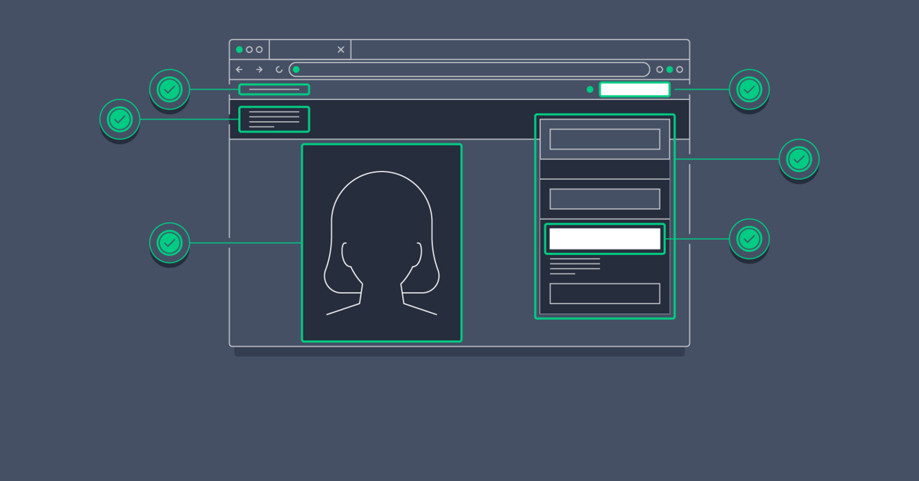
A landing page is a standalone web page designed with a specific purpose in mind, such as promoting a product, service or event, or capturing leads through a sign-up form. Landing page design is the process of creating a visually appealing, user-friendly page that effectively communicates the main message and encourages users to take a desired action.
A well-designed landing page should have the following elements:
- A clear headline that conveys the main message and value proposition
- Compelling visuals, such as images or videos, that support the main message
- A simple and concise description that explains the product or service and its benefits
- A strong call-to-action (CTA) that motivates users to take the desired action, such as filling out a form or making a purchase
- Minimal distractions, such as navigation links or unnecessary information, to keep the focus on the main message and CTA
- A well-organized layout that makes it easy for users to understand and engage with the content
- Optimized for search engines to improve visibility and drive traffic to the landing page.
Landing page design aims to create a page that effectively communicates the main message, engages users, and converts them into customers or leads.
Simple Navigation in a Website and App
Navigation in a website refers to the system that allows users to access and move through the content on a website. UX (User Experience) design is the process of designing a website in a way that creates a positive and seamless experience for the user.
Here are some tips to design effective website navigation for a great user experience:
- Organize content into clear categories: Group related content together and give each category a clear name that accurately describes its content.
- Make it easy to find: Place the navigation menu in a consistent and easy-to-find location, such as at the top of the page or on the left-hand side.
- Use descriptive labels: Use clear and concise labels for each navigation item that accurately describe the content users will find when they click on it.
- Keep it simple: Limit the number of navigation items to what is necessary, and avoid using too many sub-menus or nested items.
- Make it intuitive: Use visual cues and patterns that are familiar to users, such as hamburger menus for mobile or drop-down menus for desktop.
- Test with users: Conduct user testing to ensure that the navigation is easy to use and that users can find what they need quickly and efficiently.
- Consider different device types: Design the navigation to work well on different devices, including desktop, tablet, and mobile.
- Use responsive design: Make sure the navigation adjusts to different screen sizes and adjusts the layout to provide a good user experience on any device.
By following these tips, you can design effective website navigation that creates a positive user experience, improves the user’s ability to find what they need, and supports the overall goals of your website.
User Friendly simple Form Design
Form design is an important part of User Interface (UI) and User Experience (UX) design for a website. It is the process of creating forms that are both aesthetically pleasing and user-friendly. Here are some tips to improve UI and UX for form design on a website:
- Keep it simple: Make sure the form is straightforward and easy to understand, with clear labels and instructions. Avoid using unnecessary fields and keep the form as short as possible.
- Make it visually appealing: Use a consistent layout, typography, and colour scheme to make the form look attractive and professional.
- Provide clear feedback: Use clear error messages to inform the user when they have made a mistake, and use visual cues such as colour and animation to indicate when a field is required or has been filled in correctly.
- Use progressive disclosure: Only ask for the information that is necessary, and use techniques such as show/hide fields or multi-step forms to make the process less overwhelming for the user.
- Make it mobile-friendly: Make sure the form is optimized for mobile devices, with large touch targets and a layout that works well on smaller screens.
- Test with users: Conduct user testing to ensure that the form is easy to use and that users can complete it quickly and efficiently.
- Consider the context: Think about the user’s context and their goals, and design the form to fit their needs. For example, a form for a financial transaction might need to be more secure and have more fields than a form for a newsletter sign-up.
- Ensure security: Make sure the form is secure and protects sensitive information, such as personal or financial data. Use secure connections, encryption, and other security measures to keep the user’s data safe.
By following these tips, you can create forms that are both aesthetically pleasing and user-friendly, and that improve the overall user experience on your website.
Well-organized Content Layout
A well-organized and easy-to-read layout is crucial for a great user experience. Make sure the content is clearly separated with a clear hierarchy of information, using headings, subheadings, and bullet points to help users understand the information quickly.
Improving content layout design is an important aspect of User Interface (UI) and User Experience (UX) design. The layout of the content on your website or app can have a big impact on how users perceive your brand and how easy it is for them to find what they’re looking for. Here are some tips to improve content layout design in UI and UX:
- Keep it simple: Use a clean, uncluttered layout that is easy to navigate and understand. Avoid using too many different elements or designs, and keep the layout consistent across the website.
- Use clear typography: Choose clear and legible typefaces that are easy to read, and make sure the text size and line spacing are appropriate for the content.
- Use whitespace effectively: Use whitespace to separate different elements on the page and make the content easier to scan and read.
- Make it visually appealing: Use images, colour, and other visual elements to make the content more engaging and appealing.
- Consider the user’s context: Think about what the user is trying to do and what they want to achieve, and design the layout accordingly.
- Make it mobile-friendly: Make sure the layout works well on different devices and screen sizes, including smartphones and tablets.
- Test with users: Conduct user testing to ensure that the layout is easy to use and that users can find what they’re looking for quickly and easily.
Optimize Website Load Time
Fast load times are critical for a great user experience. Optimize images and minimize the use of heavy plugins to minimize the load time and ensure a smooth user experience.
Improving load time is a crucial aspect of User Interface (UI) and User Experience (UX) design, as it can greatly affect how users perceive your website or app. A slow-loading website can lead to frustration, decreased engagement, and lost customers. Here are some tips to improve load time in UI and UX design:
- Optimize images: Compress images and use the appropriate file format (e.g., JPEG, PNG) to reduce their size and speed up the loading time.
- Minimize HTTP requests: Minimize the number of files that need to be loaded by combining multiple files into one, such as combining CSS and JavaScript files into a single file.
- Use a Content Delivery Network (CDN): A CDN stores and serves content from multiple locations, reducing the distance between the user and the content, and improving load time.
- Minimize the use of plugins and third-party scripts: Only use plugins and scripts that are necessary, and consider alternatives that are faster and more lightweight.
- Use lazy loading: Only load images and other content as the user scrolls down the page, reducing the amount of content that needs to be loaded all at once.
- Optimize the code: Make sure the code is optimized and that there is no redundant or unnecessary code that could slow down the load time.
- Monitor load time regularly: Regularly monitor the load time of your website or app to identify and fix any performance issues, and to ensure that it continues to perform well.
You can improve the load time of your website or app, making it faster and more user-friendly, and improving the overall user experience.
Users Immediate Feedback
Immediate feedback is important for users to know that their actions have been received and processed. Provide clear feedback on form submissions, button clicks, and other interactions to let users know that their actions have been successful.
Improving feedback in User Interface (UI) and User Experience (UX) design is important for creating a positive user experience. Feedback can come in many forms, including visual cues, messages, and confirmations. Here are some tips to improve feedback in UI and UX design:
- Make it clear and noticeable: Feedback should be clear and noticeable, and should provide information about the result of the user’s action.
- Use visual cues: Use visual cues, such as colour changes, animations, or icons, to provide feedback without interrupting the user’s flow.
- Provide instant feedback: Provide feedback as soon as the user takes an action, so they know that their action has been received and processed.
- Use positive reinforcement: Use positive reinforcement to encourage users to take specific actions, such as highlighting successful actions or providing incentives.
- Personalize feedback: Personalize feedback to make it more meaningful to the user, such as using their name in a confirmation message.
- Provide clear error messages: When there is an error, provide a clear and concise error message that explains what went wrong and how to fix it.
- Test with users: Conduct user testing to ensure that the feedback is clear and effective, and to identify any areas for improvement.
Optimize Mobile Responsiveness Design
Mobile responsiveness refers to the ability of a website or application to adapt its layout and content to the device it is being viewed on. This is important because more and more people are accessing the internet on mobile devices, such as smartphones and tablets, and a website or app that is not optimized for these devices can be difficult to use and lead to a poor user experience.
A responsive website or app adjusts its layout and content to the size and orientation of the device it is being viewed on, providing an optimized user experience. For example, a responsive website will adjust the size of text, images, and buttons to be easily readable and accessible on a small mobile screen, while still providing an optimal experience on a larger desktop screen.
Mobile responsiveness is an important aspect of User Experience (UX) design, as it ensures that users can access and use a website or app on any device, without having to struggle with a poorly designed or difficult-to-use interface. By making sure that a website or app is mobile responsive, you can improve the overall user experience and increase engagement.
Improving mobile responsiveness in User Interface (UI) and User Experience (UX) design is important for ensuring that your website or app provides a positive user experience on any device. Here are some tips to improve mobile responsiveness in UI and UX design:
- Use responsive design: Use responsive design to ensure that your website or app adjusts its layout and content to the size and orientation of the device it is being viewed on.
- Optimize images: Optimize images for mobile devices, so they load quickly and don’t take up too much space on the screen.
- Use larger font sizes: Use larger font sizes for mobile devices, to make the text more readable on small screens.
- Simplify navigation: Simplify navigation for mobile devices, by using a single-column layout and large touch-friendly buttons.
- Use touch-friendly design: Use touch-friendly design elements, such as larger buttons and more padding, to make it easier for users to interact with your website or app on a touch screen.
- Minimize the use of pop-ups: Minimize the use of pop-ups on mobile devices, as they can be difficult to close and interrupt the user’s flow.
- Test on different devices: Test your website or app on different mobile devices, to make sure that it provides a positive user experience on all devices.
Users Accessibility
Accessibility refers to the design of products, devices, services, or environments for people with disabilities. In the context of web design and development, accessibility refers to the practice of making websites, applications, and other digital products usable for people with disabilities, including those visual, auditory, motor, and cognitive disabilities.
The goal of accessibility is to ensure that everyone, regardless of their abilities, can access and use digital products and services. This includes designing websites and apps that are usable with keyboard-only navigation, providing alternative text for images, and designing content that is readable with assistive technologies such as screen readers.
Accessibility is an important aspect of User Experience (UX) design, as it ensures that everyone can access and use a website or app, regardless of their abilities. By making sure that a website or app is accessible, you can improve the overall user experience and increase engagement, while also being compliant with accessibility regulations such as the Americans with Disabilities Act (ADA) and the Web Content Accessibility Guidelines (WCAG).
Improving accessibility in User Interface (UI) and User Experience (UX) design is important for ensuring that your website or app is usable for everyone, regardless of their abilities. Here are some tips to improve accessibility in UI and UX design:
- Use semantic HTML: Use semantic HTML, such as header tags, to clearly define the structure of your content and make it easier for assistive technologies to interpret.
- Provide alternative text for images: Provide alternative text for images, so that users with visual impairments can understand the content of images with the help of a screen reader.
- Design for keyboard accessibility: Design for keyboard accessibility, by making sure that all functionality can be performed using the keyboard, and by providing clear focus styles to indicate which element is currently selected.
- Use color contrast: Use high color contrast to ensure that text is readable and accessible for users with color blindness or low vision.
- Provide captions and transcriptions: Provide captions and transcriptions for video and audio content, to make it accessible for users who are deaf or hard of hearing.
- Test with assistive technologies: Test your website or app with assistive technologies, such as screen readers, to make sure that it is accessible and usable for users with disabilities.
In conclusion, by focusing on these 8 key areas of UI and UX design, you can create a product that is not only visually appealing but also intuitive and easy to use for all users. Investing time and resources into 8 Best Places to Improve UI and UX Design for Enhanced UI and UX design skills and can help improve the overall user experience, increase conversions, and drive growth for your product.
Related Blog Post


Popular Blog Post

Featured Products